The Silent Exit.
High-intent buyers leave within 10 seconds. Here is the architectural reason why.
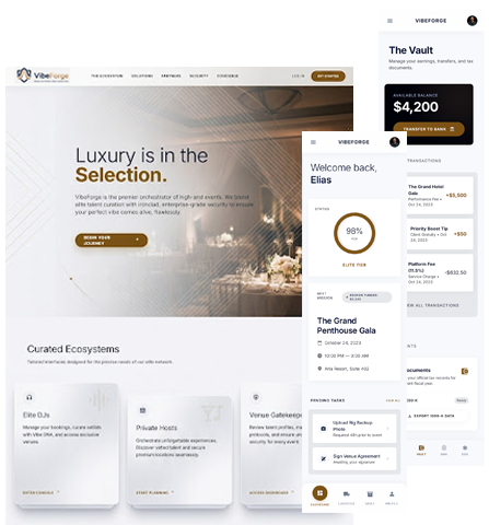
Choice Paralysis
Hick's Law states that every additional menu item exponentially increases decision time. If you give a user 12 links, they will click none of them.
Interaction Design FoundationF-Pattern Scanning
Users do not read websites; they scan in an F-shape. Dense marketing paragraphs are entirely skipped. You must use strict typographic hierarchy.
Nielsen Norman Group DataThe 95% Drop
As the number of structural elements on a page increases from 400 to 600, the mathematical probability of a lead converting plummets by 95%.
Think With Google Log
Google's research proves users form a terminal aesthetic judgment about your brand in 50 milliseconds. If the layout is cluttered, their brain instantly categorizes you as untrustworthy.
The Physical Mechanics of Mobile Conversion
The Thumb Arc
Physical ergonomics dictate digital success. Research shows that 49% of smartphone users rely entirely on a single thumb to navigate. If your most important "Emergency Service" button is tucked into the top-right corner of the screen—the hardest physical quadrant to reach on modern large phones—you are actively creating physical friction. High-converting sites map primary actions strictly to the natural lower-third thumb arc.
Smashing Mag: Mobile ErgonomicsThe Form Cliff
When a user finally decides to contact you, your contact form becomes the ultimate choke point. Extensive data proves that every additional field you ask a user to fill out reduces the total conversion rate. If you are asking a homeowner for their street address and "how they heard about you" before they can even request a plumbing quote, they will abandon the form. We engineer binary, low-friction conversion gates.
HubSpot Form AnalyticsThe Illusion of Motion.
Traditional agencies love to pitch homepages featuring massive, auto-rotating image sliders and complex entrance animations. It looks incredibly impressive on a high-resolution office monitor during a sales presentation. But it is absolute poison for local lead generation.
Human evolutionary psychology is hardwired to ignore elements that move autonomously, automatically categorizing them as advertisements. This phenomenon is called Banner Blindness. When an agency puts your core services inside a moving carousel, they are effectively hiding your business from the customer's conscious attention.
The 1% Click Myth
Quantitative usability testing reveals that only 1% of users actually click on homepage carousels. Of that 1%, over 89% click the very first slide. The rest of your moving content is entirely invisible to the buyer. We replace moving fluff with static, high-contrast, permanent value propositions.
Nielsen Norman Group StudyThe Page-Count Lie.
Have you ever wondered why traditional agencies pitch local contractors massive, 40-page website builds? It isn't because a local plumber needs 40 pages to convince someone to fix a toilet.
They charge by the page. It is difficult to justify a $15,000 invoice for a tight, high-speed 3-page site. So, they inflate the architecture. They add unnecessary "Resources" tabs, nested drop-downs, and corporate fluff to validate their fee.
Amazon Web Services (AWS) data proves that 88% of online consumers are less likely to return to a site after a bad user experience.
When you buy complexity, you pay the invoice twice: once to the agency, and forever in lost leads.
Don't make them think. Make them act.
We use a methodology called Forensic UX. This means we analyze exactly where your customers get confused, frustrated, or lost, and we systematically strip those roadblocks out of the code. We engineer every button, image, and text block to push the user toward a single decision: Call the desk or book online.